Steps
- Discovery
- UX Design
- UI Design
- Final product
Description
Signature Pharmacy is a SaaS product with a mission to provide a discreet, confidential, and free pharmacy delivery service for patients.
The platform leverages cloud-based technology to provide a set of tools and features to streamline pharmacy management including medication inventory management, prescription management, customer profiling, and others.
Besides, the service includes a mobile platform for courier delivery that allows to get real-time information on the orders.
Discovery
Problems
At this stage, we conducted a thorough analysis of client’s business processes and identified several key problem areas. We set about examining each stage in detail, from order to delivery, to identify exactly where the difficulties arise and how we can address them.
01
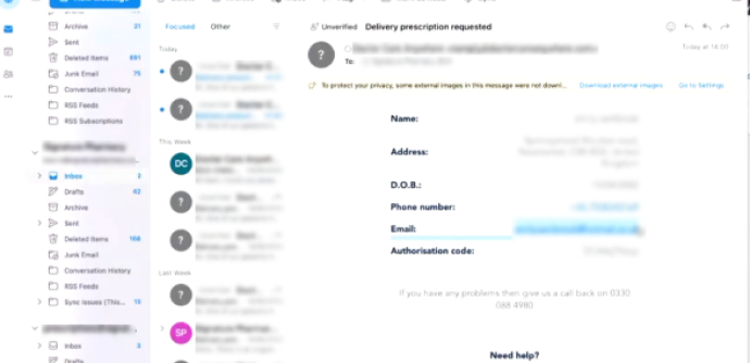
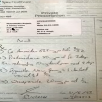
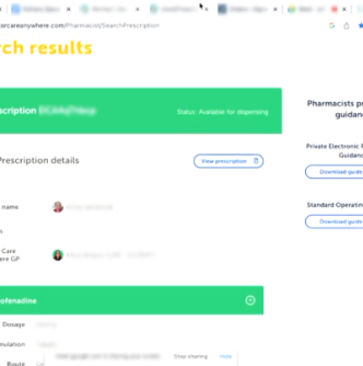
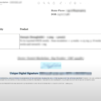
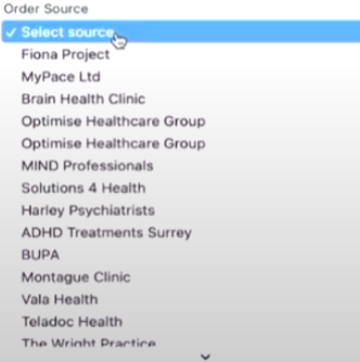
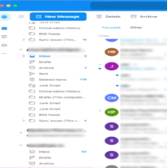
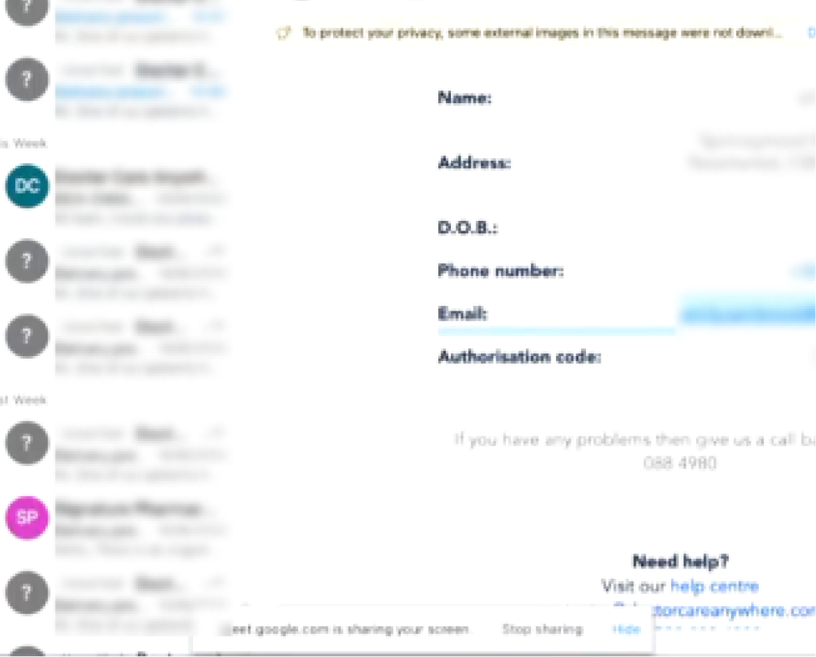
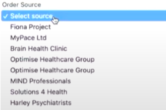
All the orders come from 4-5 different sources: 3-d party prescription systems, own prescription system, Various Email types and there before no unified way to put all that in the system and process. So everything before so all over the place and very easy to mistake.
02
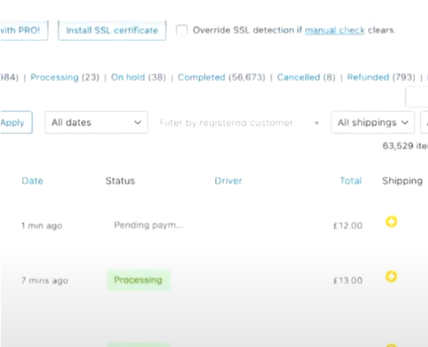
Order processing was absolutely manual gave no guidance and lay on the shoulders of employees. That opened a huge possibility for errors, confusion, and inefficiency time losses.
03
No clear connections with curriers and no way to guide them efficiently on the delivery trip, client details, and exception cases.
04
Client check-out was confusing gave not enough details on the delivery, and didn’t cover all the client types.
05
Each clinic had to be charged for their patients and Signature Pharmacy had to pay commission to 3d party services for the clients brought every month. But there was no consolidated data based which could be used for that. Moreover both processes were done manually.
06
No way to see trends and make data-driven business decisions.
Discovery
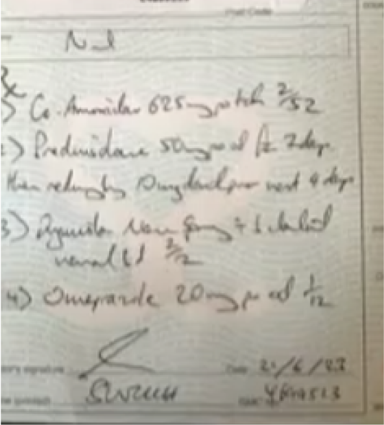
The processes looked like this
The work was done on multiple platforms, including hand-drawn work. The haphazard nature didn’t allow the business to grow as it required considerable time and effort to carry on normal day-to-day operations.
Discovery
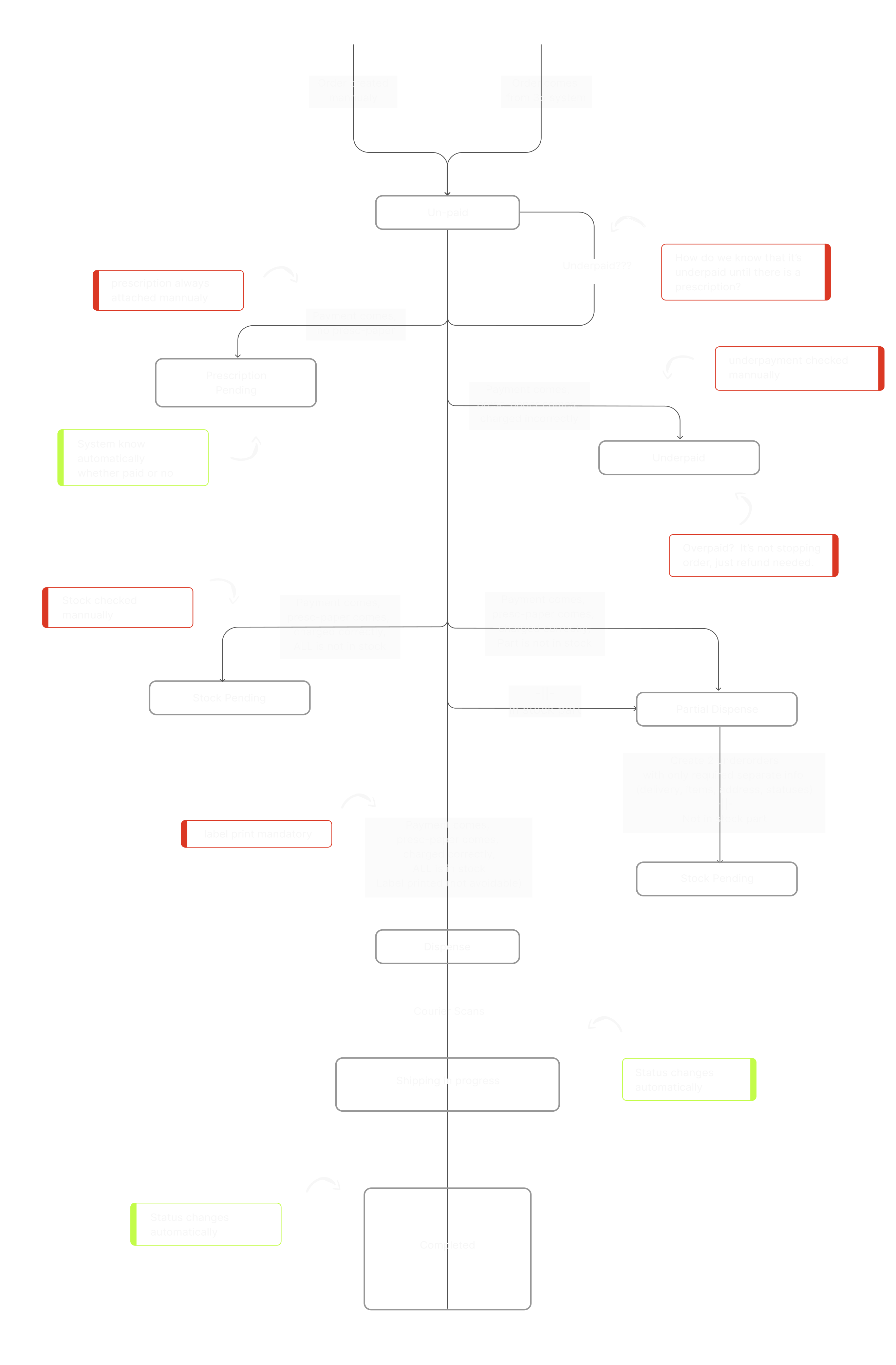
Order processing we faced with
We rebuilt the order processing flow based on progressive disclosure principles to make it straightforward, holistic & automated as possible.
Discovery
Solutions
It was decided to develop a comprehensive operating system integrating all stages of order processing
and customer management, as well as to create a mobile platform for courier delivery, which would allow real-time information on orders.
UX Design
Design Process
At this stage, we develop a comprehensive grasp of the critical processes and their associated timelines. Through iterative discussions with the client, we collaboratively refine the screen logic and visual style until both parties are thoroughly satisfied.
Discovery
1
Got acquainted with the current product, particular product state assessment.
2
Collecting product feedback & desired results out of stakeholders.
UX Design
3
Information architecture creation/refinement.
4
Discussion scheme (architecture) with client (if good -> next step, no -> iteration).
5
Wireframing, visual style defining & design system establishment (in parallel).
UI Design
6
Iterative discussion with client until both sides are happy with screen logic and visual style.
7
High fidelity design. Iterative discussion.
8
Screen preparation for the development.
9
Interactive Proto.
Development
10
Development support & Testing (logic & visual).
UX Design
User Persona
Is aimed at creating a clear and deep understanding of the target audience for whom the product or service is being developed. This is where the "user persona" or "user portrait" is formed - a detailed profile of the future user.
Persona
Ted, 42 years old. Operation manager.
Work experience
15 years as a operation manager in pharmaceutical company.
Responsibilities
Collecting contentOrders from website or by phone, dispensing medications, prescription verification, medication storage and inventory management, patient recordkeeping.
Pains
Experiences difficulties and setbacks in his work, especially when it comes to complex operational processes.
UX Design
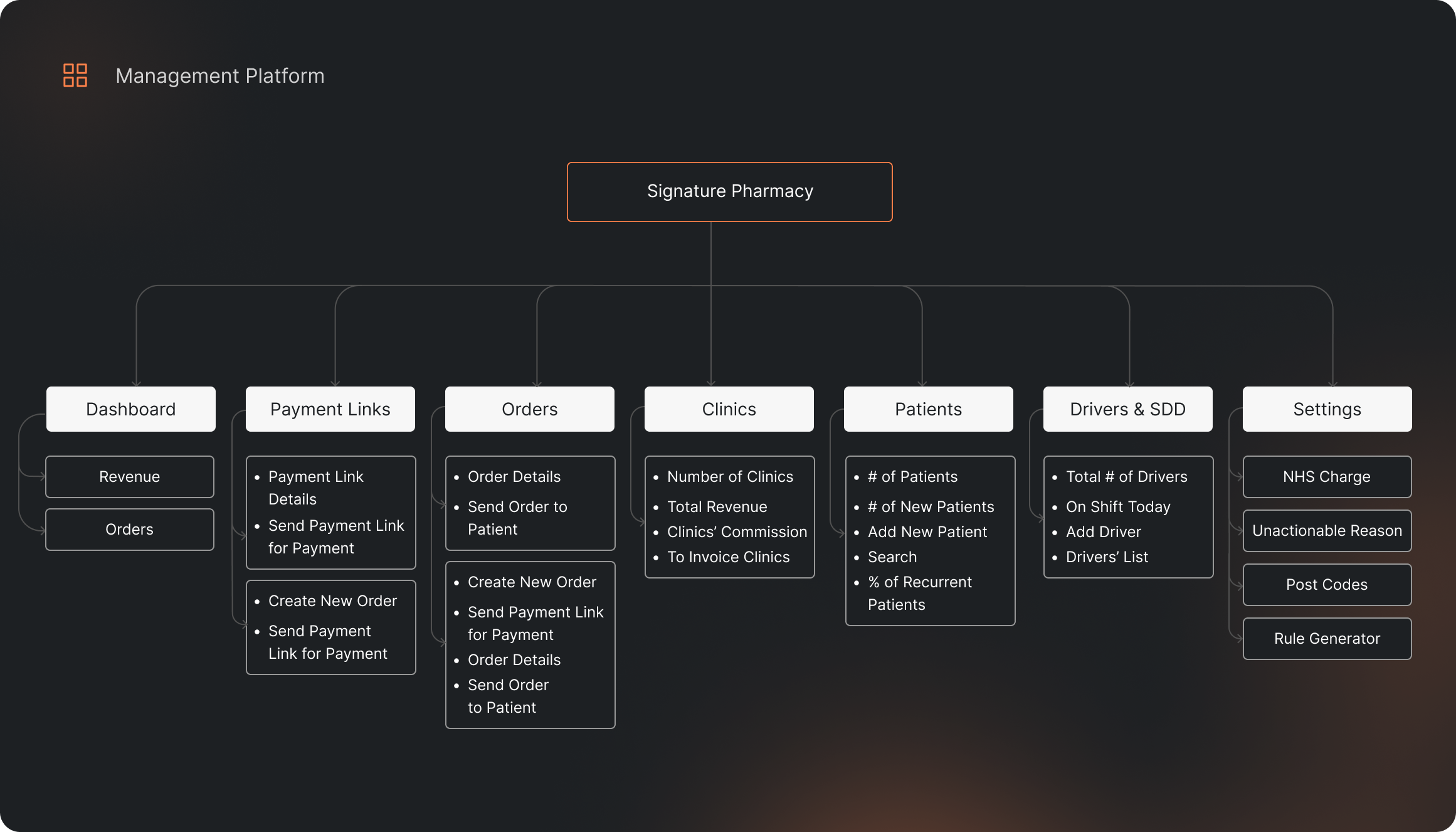
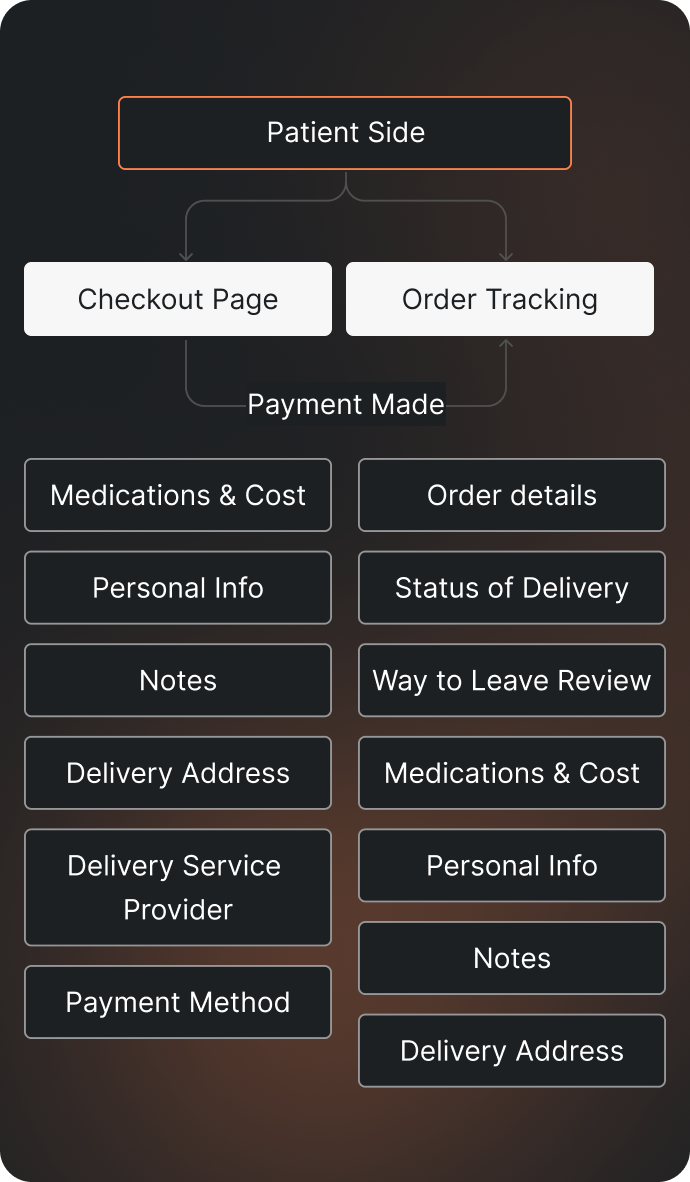
Information architecture
A fundamental stage in the design of information systems, websites and applications that aims to organize and structure information to make it accessible, understandable and easily manageable for users.

UI Design
Color and typography
Choosing and coordinating color palettes and fonts help establish a recognizable style and create an appealing visual experience, which has a significant impact on user engagement and perception.



final product
Complete rebuilding and automation of the order processing based on the progressive disclosure principles.
The new system contains clear guidance and tips which made it easy to understand and navigate the system by the end users.
Additionally, a new app for delivery drivers provides real-time information about the orders, optimizes routes, and delivers prompt updates on the order statuses.
Dashboard
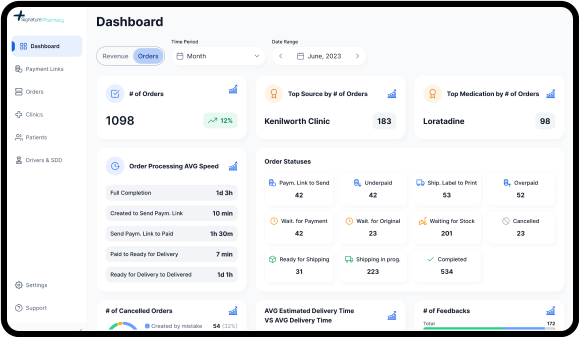
Handful metrics representing and measuring all the pharmacy processes with a possibility to dive into detailed analytics for every matter.

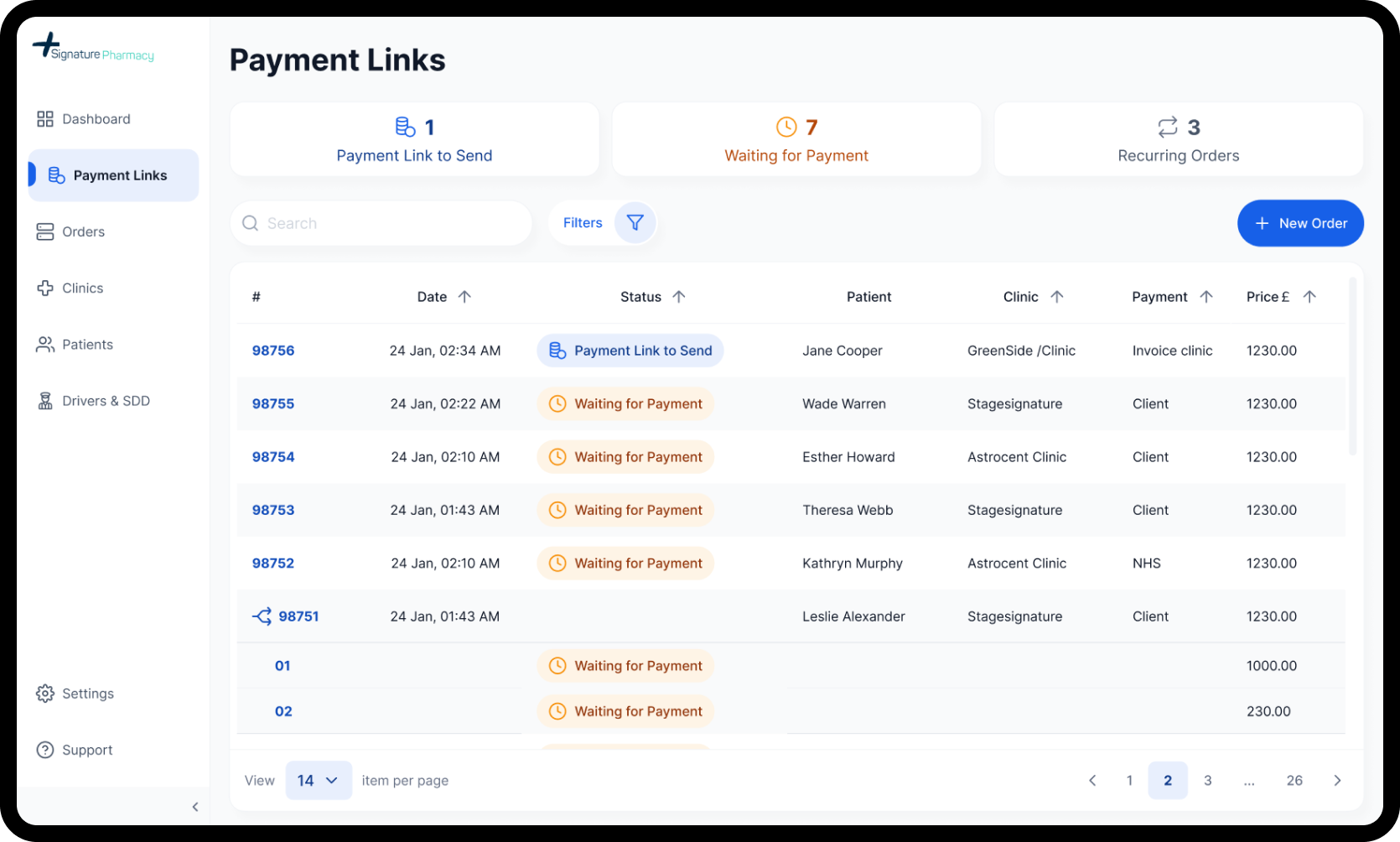
Payment Links
All the integrated, aggregated and standardized orders come to one smart & simple system, where can be easily processed and prepared for payment.
Orders
When orders are paid, everything should be double checked and orders have to be prepared for shipment.

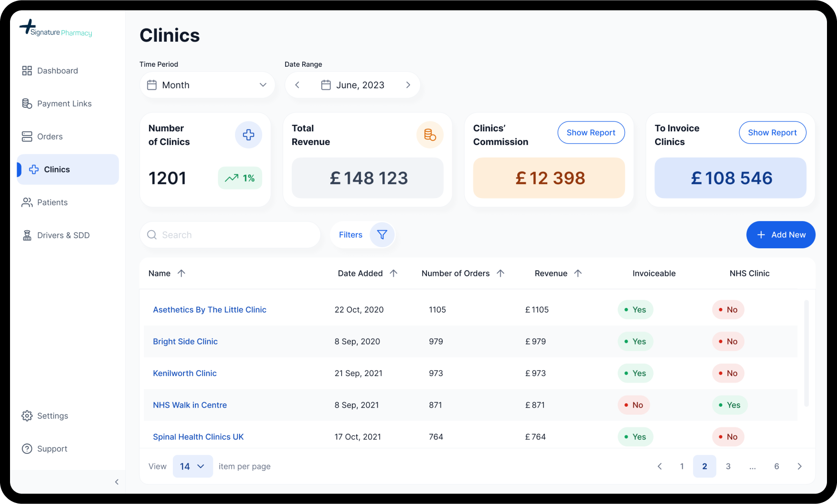
Clinics
Here pharmacy admin can review basic info about associated clinics, revenue from them, commissions to paid, sum to invoice and generate needed reports.
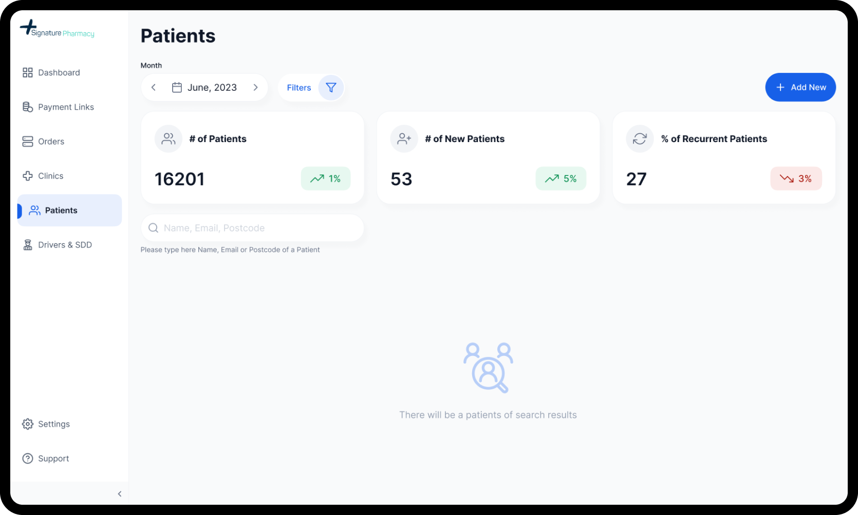
Patients
All information about current and past patients in one place with sensible metrics.
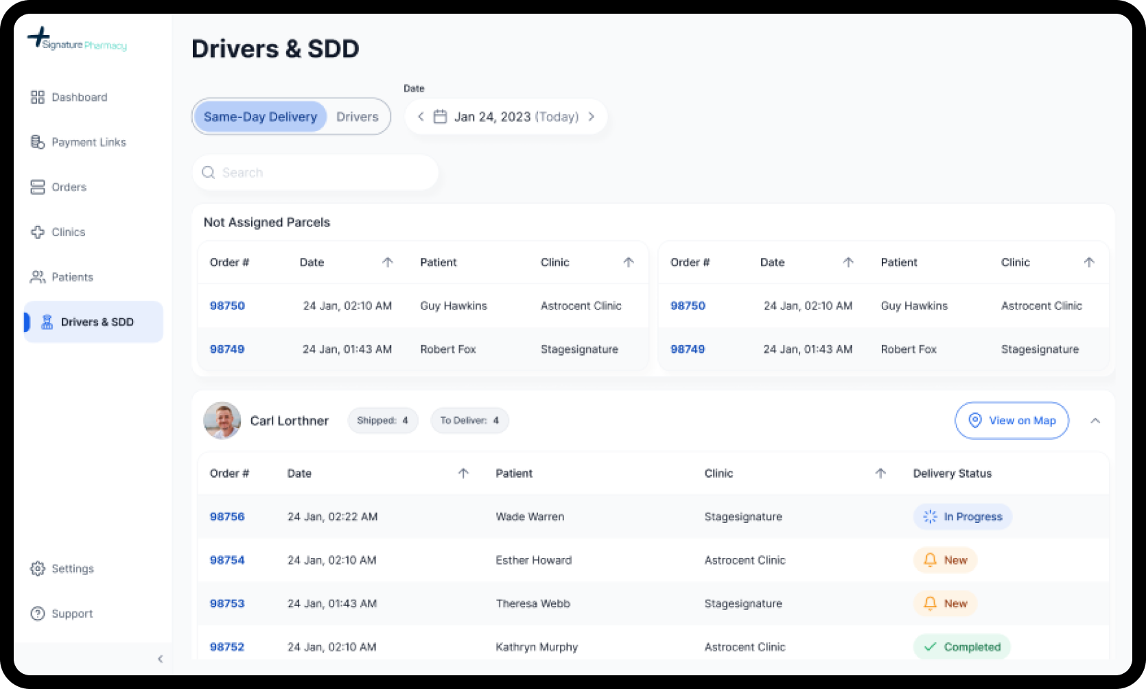
Drivers & SDD
When orders are paid, everything should be double checked and orders have to be prepared for shipment.
Order Tracking
While order is being prepared for delivery and being delivered, patient canalways check an order status and details with informative and simple ordertracking page.
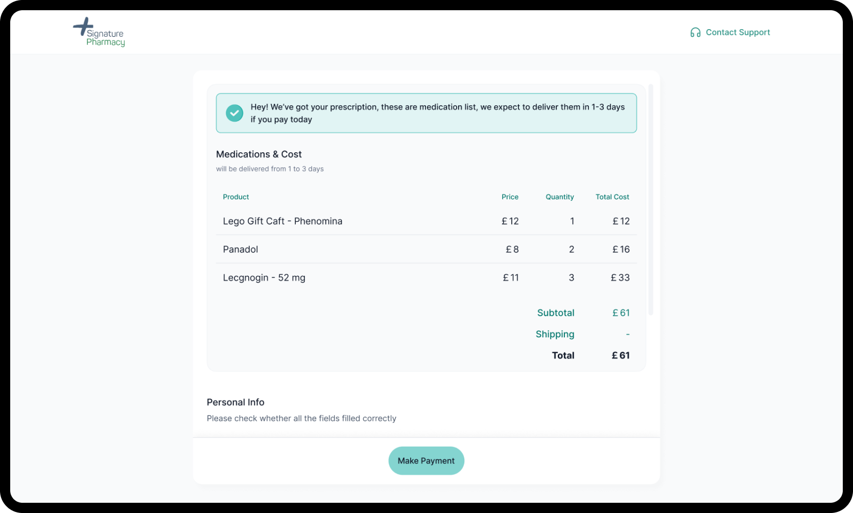
Checkout
When payment links is sent to the patient, he has to go through easy and straightforward checkout process.
final product
Delivery Worker Mobile App
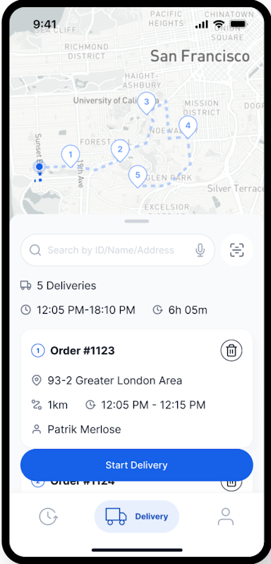
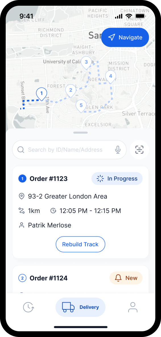
When orders are prepared for delivery, delivery begins, supported by flawless and intuitive mobile app for couriers.
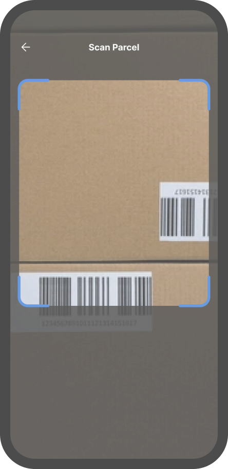
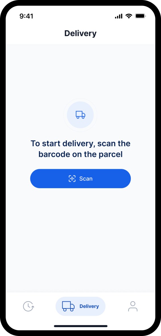
Scanning Parcels
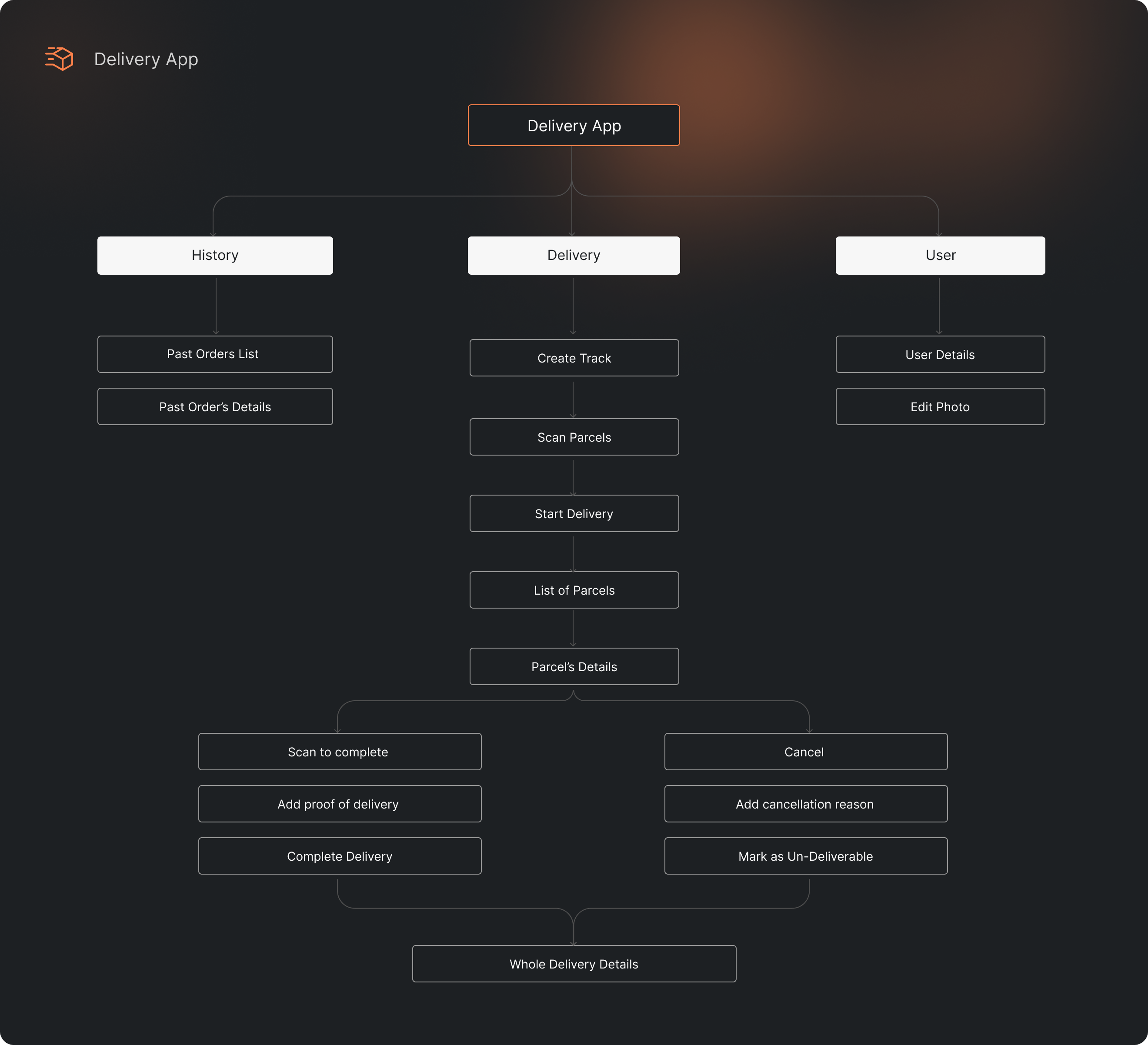
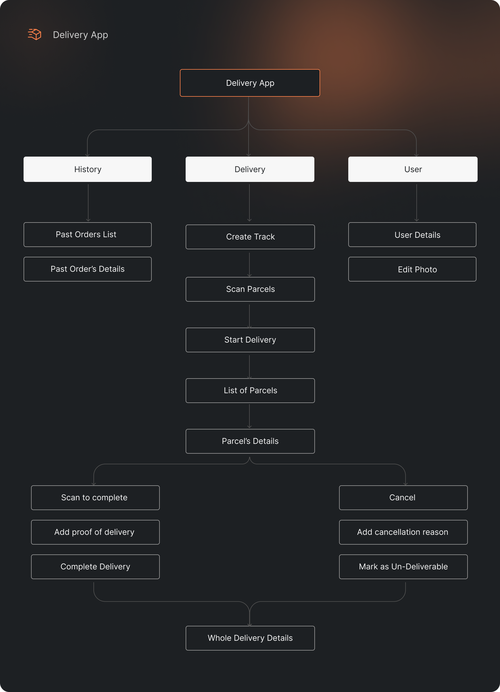
Each delivery process starts from scanning a parcels’ barcodes. After all parcels scanned correctly the driver can build his track and move to the next step.

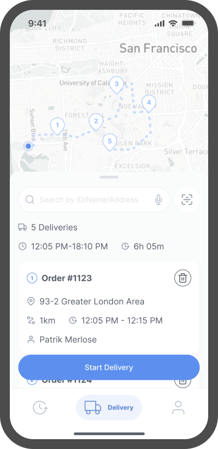
Delivery Process
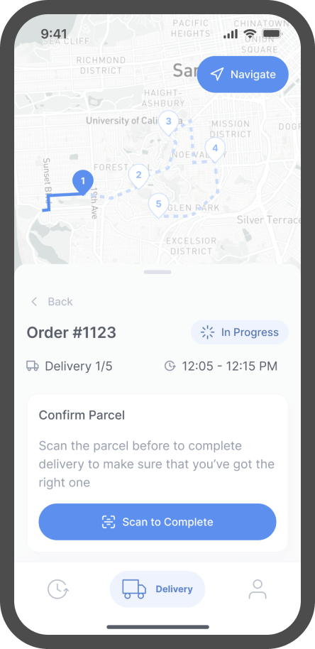
When the track is build the driver can start the delivery itself. The delivery app has inbuild maps for convenient and quick navigation. The driver can also change the order of parcels if needed.
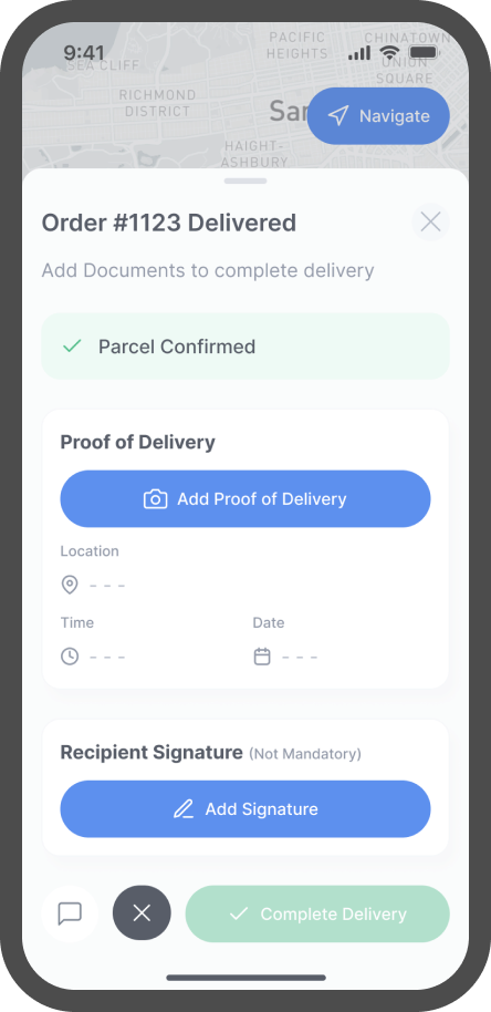
Delivery Confirmation
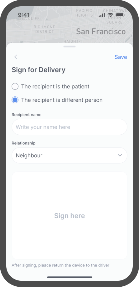
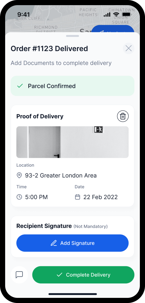
As we don’t want to upset the clients by messing up parcels all the drivers have to scan parcel once again before finishing the delivery to make sure that the parcel is the right one. After that the driver has to receive a signature confirmation from the recipient that the parcel is delivered and mark in the app that the process is finished.
RELATED CASE STUDIES
Contact usand let’s work together
Your form was successfully submitted!
We will be in touch with you shortly!

